Power BI Dashboard Design & Visualisation
Making Insight Accessible Across the Business
Executive Overview
A well-structured data warehouse and a governed semantic model are the foundations of reliable analytics, but they are invisible to the people who need to make decisions. The point at which data becomes genuinely useful is when it is surfaced in a dashboard that the right person can open, understand, and act on without training, without support from IT, and without uncertainty about whether the figures are correct.
That is harder to achieve than it appears. Most organisations have Power BI licences and have built some dashboards, but the dashboards they have are inconsistent in design, variable in accuracy, and rarely adopted with confidence by the leadership teams they were built for. Reports accumulate. Definitions diverge. Stakeholders revert to spreadsheets because they trust them more than the tool that was supposed to replace them.
PrecisionPoint approaches dashboard design as a discipline in its own right, distinct from data engineering and equally important. Every dashboard delivered by PrecisionPoint is built against a governed, reconciled data layer; designed for a specific role and decision-making context; and developed using a structured design process that balances analytical depth with usability. The result is a reporting environment that people use, trust, and rely on, rather than one they route around.
Why Dashboard Design Fails in Practice
Organisations that have invested in Power BI infrastructure frequently find that adoption plateaus well below the level they anticipated. The dashboards exist, but they are not used in the way they were intended. Several recurring patterns explain why:
Reports built for the developer, not the decision-maker
Many Power BI reports are built by analysts or developers who have deep familiarity with the underlying data but limited exposure to how the intended audience actually works. The result is a report that answers the questions the developer thought were being asked, rather than the questions a Finance Director or Operations Manager needs answered during a board meeting or a month-end review. Layouts are dense, visual hierarchies are absent, and the path from summary to detail is unclear.
No consistent design language across the reporting estate
When dashboards are built independently by different team members or delivered by different partners over time, the result is a fragmented reporting environment in which each report looks different, uses different colour conventions, and presents figures in different formats. Users cannot navigate from one report to another with confidence, and the absence of a consistent visual language erodes trust in the estate as a whole.
Calculations embedded at report level
When business logic (revenue definitions, margin calculations, period comparisons) is embedded within individual Power BI reports rather than in a shared semantic model, the same measure will be calculated differently in different reports. Finance teams routinely encounter situations where the revenue figure in the CFO dashboard does not match the figure in the sales performance report, both of which differ from the number in the divisional P&L. The root cause is not bad data; it is architecture: measures defined at report level cannot be governed or certified in the way that measures defined in a shared semantic model can.
Dashboards that present data without supporting a decision
A dashboard that shows twelve KPI cards and three charts answers the question “what happened?” but rarely supports the question “what should we do about it?” Effective dashboard design requires an understanding of the decisions that each stakeholder needs to make, not just the metrics they want to monitor, and structures the visual narrative accordingly. Without that context, dashboards become sophisticated wallpaper: visually credible, analytically limited.
Performance issues that undermine adoption
A dashboard that takes twenty seconds to load after every filter interaction will not be used in a live meeting. Performance is a design and architecture concern, not merely a technical one. Reports built without attention to query folding, aggregation tables, or semantic model optimisation frequently exhibit performance that makes them impractical for the use cases they were designed to support.
PrecisionPoint’s Approach to Dashboard Design
PrecisionPoint’s dashboard design practice is built around a structured methodology that connects the needs of each stakeholder role to the data architecture that supports them, and translates that connection into a Power BI experience that is both analytically robust and genuinely usable.
Discovery: understanding the decision, not just the metric
Every dashboard engagement begins with a structured discovery process in which PrecisionPoint works with stakeholders to understand the decisions they are responsible for making, the cadence at which they need analytical support, and the data sources relevant to those decisions, including ERP, CRM, HR and operational systems. This is not a requirements-gathering exercise in the conventional sense. It is a design input: the output is a clear map of what each role needs to see, at what level of granularity, and in what context.
Data layer validation before design begins
Dashboard design cannot proceed reliably without confidence in the data beneath it. PrecisionPoint validates the data layer, whether that is an existing data warehouse, a Power BI semantic model, or a set of source connections, before committing to dashboard design. Where gaps, inconsistencies, or unresolved calculation conflicts exist in the data layer, PrecisionPoint identifies and resolves them before they are embedded in a live report. This protects both the integrity of the finished dashboard and the time invested in building it.
Role-based design with a shared visual language
PrecisionPoint designs dashboards around clearly defined role profiles, including CFO, Finance Director, Financial Controller, Operations Manager and Sales Director, each with a consistent visual language that is applied across the reporting estate. Colour usage, typography, KPI card formats, chart types, and navigation patterns are standardised within a design system that makes individual dashboards immediately recognisable as part of the same analytical environment. Users moving from the executive P&L summary to the operational cost detail encounter the same visual conventions, reducing cognitive load and accelerating adoption.
Iterative build with stakeholder review cycles
PrecisionPoint builds dashboards iteratively, with defined review checkpoints at which stakeholders interact with working prototypes rather than static wireframes. This approach surfaces design decisions that cannot be resolved in advance, including the preferred level of chart granularity, the most useful default date filter, and the drill-through paths that finance teams actually use, and incorporates that feedback before the report reaches production. It also builds stakeholder familiarity with the finished product before formal deployment, which accelerates adoption.
Performance engineering as part of delivery
Dashboard performance is treated as a design requirement, not a post-delivery concern. PrecisionPoint’s developers apply Power BI performance best practices throughout the build: semantic model optimisation, aggregation table design, Import versus DirectQuery mode selection based on data volume and refresh requirements, and DAX measure efficiency review. Reports are tested against realistic data volumes and filter interaction patterns before they are released to production.
Role-Based Dashboards for the Enterprise
Different stakeholders need different things from analytical dashboards: not only different metrics, but different levels of detail, different interaction patterns, and different relationships between the numbers on screen.
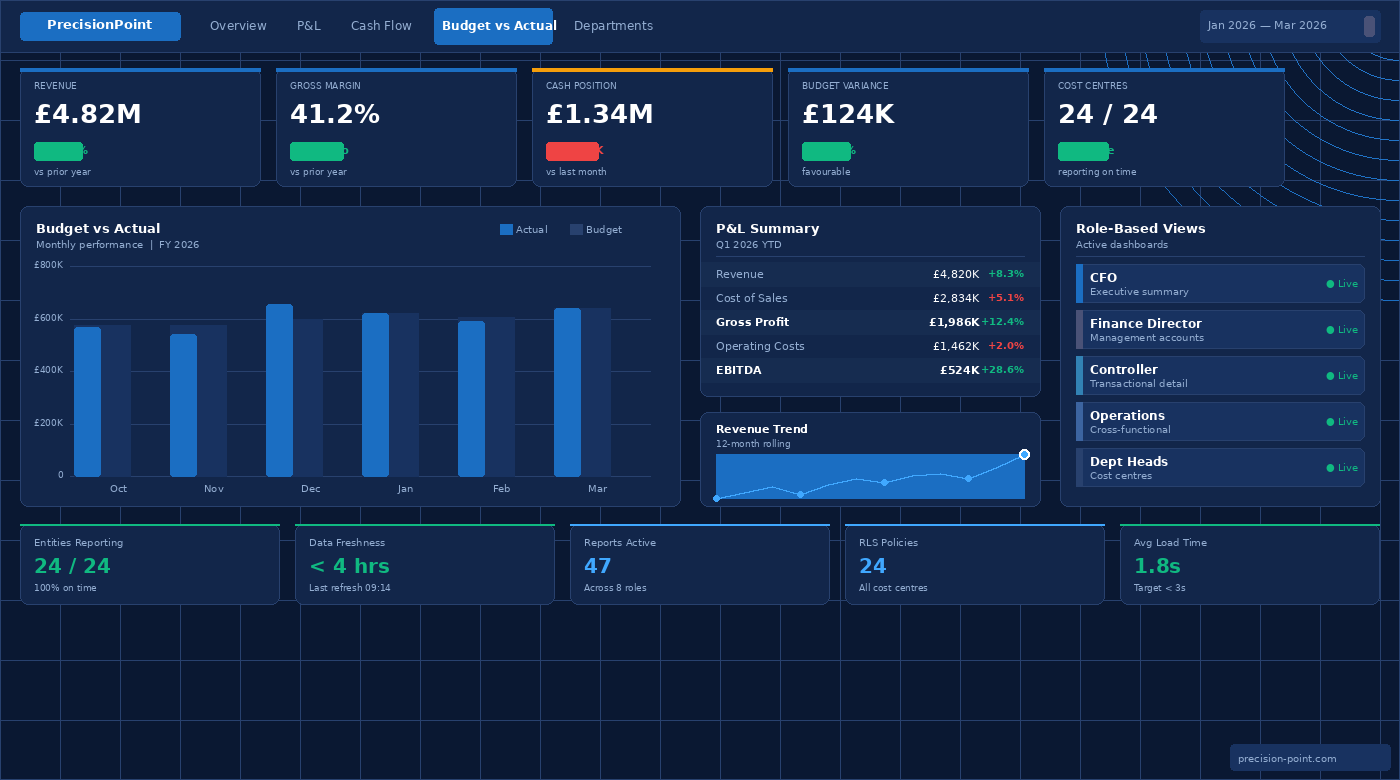
 PrecisionPoint designs dashboards with role specificity as a core principle.
Executive and CFO dashboards
Executive dashboards are designed for high-frequency consumption and low-friction interpretation. The CFO opening a dashboard during a board meeting needs to reach a confident understanding of the business’s financial position in under two minutes, without filter interactions, without drill-through, and without having to reconcile figures against a separate source. PrecisionPoint’s executive dashboards prioritise a small number of high-confidence KPIs, including revenue, margin, cash position and budget variance, presented with clear period comparison context and unambiguous directional indicators. Commentary fields, where appropriate, allow finance teams to annotate figures with the narrative that transforms data into board-level communication.
Finance Director and management accounts dashboards
Below the executive summary, the Finance Director or Head of Finance needs the ability to interrogate the figures that underpin the top-line numbers. PrecisionPoint designs management accounts dashboards that provide a direct, navigable path from the P&L summary into department-level cost analysis, from budget variance into the underlying journal lines, and from a consolidated group view into the individual legal entity detail. These dashboards balance summary clarity with analytical depth, and are designed around the monthly close cycle, pre-configured with the date filters, entity selections, and comparison periods that a Finance Director uses every month.
Financial controller and management accountant dashboards
Controllers and management accountants need transactional access alongside summary reporting. Their Power BI dashboards include drill-through to journal line detail, aged debtor and creditor analysis, intercompany reconciliation views, and cost centre variance breakdowns. PrecisionPoint designs these reports with the working patterns of the finance team in mind: reports that can be exported cleanly into Excel for further analysis, that support the accruals and prepayments review process, and that surface reconciliation exceptions automatically rather than requiring manual identification.
Operations and commercial dashboards
Financial data rarely tells the whole story without operational context. PrecisionPoint designs cross-functional dashboards that combine ERP financial data with operational metrics from CRM, project management, or supply chain systems, surfacing the margin-by-product, revenue-by-channel, or cost-per-unit analyses that require data from more than one source. These dashboards are designed for commercial managers and operations leaders who need financial context for operational decisions, without needing to navigate financial systems directly.
Department-level and cost centre dashboards
Budget holders across the business, including department heads, project managers and regional directors, need clear visibility of their cost position against budget without requiring access to finance systems or support from the finance team. PrecisionPoint designs department-level dashboards that surface cost centre actuals, committed costs, and budget remaining in a format that a non-finance audience can interpret with confidence. Row-level security ensures that each budget holder sees only the data relevant to their own cost centres.
Design Principles
PrecisionPoint’s dashboard design practice is guided by a set of principles that are applied consistently across every engagement, regardless of the industry, the data source, or the stakeholder audience.
Clarity before completeness
A dashboard that attempts to answer every possible question is a dashboard that answers none of them well. PrecisionPoint’s design process begins with a clear agreement on the primary question each dashboard is designed to answer, and treats additional analytical depth as a secondary consideration. Summary pages present the primary insight; drill-through and secondary pages support investigation without cluttering the primary view.
Consistent definitions, surfaced visibly
Every metric on a PrecisionPoint dashboard is defined in a shared semantic model and labelled consistently across the reporting estate. Where a metric has a specific business definition, for example where “revenue” excludes intercompany transactions or where “headcount” is measured on a full-time equivalent basis, that definition is documented and, where appropriate, surfaced within the report through tooltip or information panel. Users should never have to guess what a number means.
Navigation designed for the audience
Navigation patterns are matched to the working patterns of the audience. Executive dashboards use minimal navigation: a single-page or tabbed layout in which the primary view is immediately accessible. Operational dashboards may use a hub-and-spoke navigation structure, with a summary page linking to domain-specific detail pages. PrecisionPoint’s design process maps the anticipated navigation paths for each role before any report layout is committed to, ensuring that the navigation structure reflects how the dashboard will actually be used.
Colour with purpose
Colour in a Power BI dashboard should carry meaning, not decoration. PrecisionPoint applies a disciplined colour system in which specific colours are reserved for specific functions: performance against target (red, amber, green), directional comparison (positive versus negative variance), categorical differentiation (entity, region, product line), and brand alignment. Colour is never used arbitrarily, and dashboards are tested for accessibility in line with WCAG contrast guidelines.
Mobile and meeting-room readiness
Dashboards that will be used in board meetings or reviewed on mobile devices require design decisions that differ from those appropriate for desktop analytical use. PrecisionPoint considers the consumption context of each dashboard during design, optimising layouts for the screen dimensions and interaction patterns appropriate to each context, and creating separate mobile-optimised layouts where the use case requires it.
Key Business Outcomes
Organisations that invest in professionally designed, role-based Power BI dashboards built on governed data typically realise improvements across adoption, efficiency, and decision-making quality.
Dashboards that leadership teams actually use
The most reliable indicator of a successful dashboard programme is whether the people it was built for use it without prompting. When dashboards are designed around the specific decisions and working patterns of each role, and built on data that reconciles with the source systems, adoption follows naturally. PrecisionPoint’s clients consistently report that finance and leadership teams replace their legacy reporting processes, including spreadsheet extracts, manual PowerPoint decks and scheduled email reports, with the Power BI environment within one to two months of deployment.
Faster, more confident decision-making
When the right figures are accessible in a clear, consistent format, the time between a question arising and an answer being reached compresses significantly. Finance teams that previously spent hours preparing a specific analysis for a leadership question can redirect that effort; leadership teams that previously waited for analysis can make decisions in real time. The downstream effect on business agility is measurable.
A single version of every metric
Role-based dashboards built against a shared semantic model enforce metric consistency across the organisation. The revenue figure in the CFO dashboard is arithmetically identical to the revenue figure in the regional sales dashboard, because both are drawing from the same certified measure. Disagreements about “which number is right”, a common and corrosive feature of reporting environments built without a governed data layer, are eliminated by design.
Reduced analytical overhead for the finance team
Finance teams in most organisations spend a disproportionate amount of time producing reports rather than analysing them. When dashboards automate the production of standard reporting outputs, including management accounts, variance analysis and board pack figures, and deliver them on a defined refresh schedule, the finance team’s time is freed for the interpretive and strategic work that those outputs are supposed to support.
A scalable reporting environment
A reporting estate built on a consistent design language, a shared semantic model, and a governed data architecture is one that can be extended without fragmentation. New dashboards for new roles or new business units inherit the design language and data definitions of the existing estate. PrecisionPoint’s clients find that the marginal cost of adding a new dashboard to a well-designed environment is significantly lower than the cost of building standalone reports into a fragmented one.
Why PrecisionPoint
PrecisionPoint brings together deep Power BI expertise and over 15 years of Microsoft Dynamics ERP knowledge to deliver dashboard solutions that are analytically rigorous, visually coherent, and built on data that finance teams can trust.
Design capability grounded in data expertise
Most Power BI dashboard designers do not understand the data they are visualising at an architectural level. PrecisionPoint’s consultants combine Power BI design skills with direct knowledge of ERP financial data structures, semantic model design, and data warehouse architecture. That combination means that design decisions are informed by an understanding of the data, its granularity, refresh frequency and reconciliation status, rather than made in isolation from it.
Finance-specific domain knowledge
PrecisionPoint’s focus on finance analytics means that the consultants designing dashboards for CFOs and Finance Directors understand the context those dashboards will be used in. They understand the month-end close cycle, the structure of a management accounts pack, the difference between budget and forecast variances, and the specific ways in which intercompany eliminations affect consolidated reporting. That domain knowledge directly improves the quality of dashboard design decisions.
End-to-end ownership across the analytics stack
PrecisionPoint can own the entire analytics delivery, from ERP data extraction through PrecisionPoint Reveal, to data warehouse design, to semantic model development, to dashboard design and deployment. Organisations working with PrecisionPoint do not need to coordinate between a data engineering partner, a BI developer, and a design agency. Consistency of design intent is maintained because a single team understands every layer of the solution.
Managed services and ongoing optimisation
Dashboard requirements evolve as organisations grow, as reporting cycles change, and as new data sources become relevant. PrecisionPoint’s managed services offering includes ongoing dashboard development, semantic model maintenance, and performance monitoring, ensuring that the reporting environment continues to serve the business rather than requiring periodic redevelopment from scratch.
Frequently Asked Questions
What is role-based dashboard design in Power BI?
Role-based dashboard design is the practice of building separate Power BI dashboards for each distinct stakeholder audience, such as the CFO, Financial Controller, or Operations Manager, where each dashboard is designed around the specific decisions and analytical needs of that role, rather than providing a single generic report that attempts to serve all audiences. Role-based dashboards typically combine row-level security, which restricts data access to what each user is permitted to see, with a visual design and level of detail appropriate to that role’s working context. The result is a reporting environment in which each user sees a dashboard that is directly relevant to their responsibilities, without the clutter or inaccessibility of a report designed for a broader audience.
How long does it take to design and deliver a Power BI dashboard?
A focused Power BI dashboard for a single stakeholder role, such as an executive P&L summary or a department cost centre view, can typically be designed, built, and deployed within three to five weeks, assuming the underlying data warehouse and semantic model are already in place. A broader dashboard programme covering multiple roles across a finance or operations function, including discovery, iterative design, stakeholder review cycles, and deployment, typically spans eight to twelve weeks. Where the data layer requires development alongside the dashboard work, PrecisionPoint scopes the data and reporting workstreams together to ensure that both are delivered on a coordinated timeline.
What is the difference between a Power BI report and a dashboard?
In Power BI terminology, a report is a multi-page analytical document built in Power BI Desktop, in which each page contains one or more visualisations connected to a data model. A dashboard is a single-page canvas in the Power BI service on which tiles (individual visualisations pinned from one or more reports) are assembled to provide a high-level overview. In practice, the term “dashboard” is used more loosely to refer to any Power BI report that is designed to provide a summary view for a specific role or purpose. PrecisionPoint designs both: executive-facing single-page summary views built as Power BI service dashboards, and multi-page analytical reports with drill-through capability built in Power BI Desktop and published to the Power BI service.
How does Power BI row-level security work for department-level dashboards?
Row-level security (RLS) in Power BI is configured within the semantic model and restricts the rows of data that each user can see based on their identity. For department-level dashboards, RLS is typically configured by mapping each user, identified by their Microsoft Entra account, to one or more cost centres or legal entities within the semantic model’s security rules. When a budget holder opens the dashboard, Power BI applies the RLS filter automatically, ensuring they see only the data relevant to their cost centres. The filter is applied at the data layer, not the visual layer, which means users cannot circumvent it by modifying the report. PrecisionPoint configures and tests RLS as part of every dashboard deployment that involves multiple audiences with different data access requirements.
Can Power BI dashboards replace the monthly management accounts pack?
Power BI dashboards can replace a significant proportion of the manual effort involved in producing a monthly management accounts pack, and for many organisations they effectively do replace it, particularly for internal distribution. A well-designed Power BI environment can automate the production of P&L summaries, budget versus actual analysis, and cost centre reports that would previously have required manual extraction from the ERP, consolidation in spreadsheets, and formatting in PowerPoint. The Power BI report refreshes automatically from the data warehouse on a defined schedule, and report subscriptions deliver finished outputs to stakeholders by email at the point of data refresh. Where a formal PDF pack is still required for board or investor distribution, Power BI’s export capabilities and the Power BI Report Server can support that output alongside the interactive report.
What data sources can Power BI dashboards connect to beyond Dynamics 365?
Power BI can connect to a wide range of data sources, and PrecisionPoint regularly builds dashboards that combine ERP financial data from Dynamics 365 with data from other business systems. Common combinations include Salesforce CRM for revenue and pipeline data; Workday or HR systems for headcount and payroll data; project management platforms for capital expenditure and project cost tracking; and supply chain or manufacturing systems for operational cost and volume data. These integrations are most effectively managed through the data warehouse layer, where data from each source is cleaned, conformed, and joined before reaching Power BI, rather than through direct multi-source connections within the Power BI semantic model. PrecisionPoint’s data warehouse services support this multi-source integration architecture.
How does PrecisionPoint ensure dashboards remain accurate as data changes?
Dashboard accuracy is maintained through a combination of governed data architecture and structured refresh management. The data warehouse that underpins PrecisionPoint’s dashboards includes automated reconciliation processes that validate figures against the ERP source on each load cycle. The Power BI semantic model is maintained as a single, certified layer from which all reports draw their measures, ensuring that calculation changes are applied once and propagate to all reports automatically. Scheduled data refresh is configured within the Power BI service to refresh the semantic model on a defined cadence, typically daily for management reporting, with more frequent refreshes available for operational dashboards. PrecisionPoint’s managed services include ongoing monitoring of refresh schedules and data quality checks, with proactive alerting when anomalies are detected.
Make your data visible to the people who need to act on it.
PrecisionPoint designs and delivers Power BI dashboards that give finance leaders, operations teams, and department heads clear, trusted insight, without reliance on IT support, without ambiguity about the numbers, and without the manual effort of monthly report production.
Book a Dashboard Design Consultation: speak with a PrecisionPoint specialist about your current reporting environment, the stakeholder roles you need to serve, and the data sources that are relevant to your analytics requirements.
Request a Power BI Design Review: receive a structured assessment of your existing Power BI reports, with prioritised recommendations for improving design quality, performance, and adoption.
Explore Our Power BI Implementation Services: understand how PrecisionPoint can build the data foundation of warehouse, semantic model and dashboards as an integrated programme.
Book a Consultation | View Power BI Services | Explore Managed Services
